This data-driven visual essay, “The Naked Truth,” analyzes 6,816 complexion products to reveal implicit racial bias within the beauty industry. The narrative demonstrates how the naming and numerical ordering of foundation shades systematically prioritize lighter skin tones.
It explores how descriptors like “nude” and “natural” are overwhelmingly applied to lighter shades, while darker shades are often associated with food items, exposing a pattern of microaggressions and a lack of inclusivity in product marketing.
And, I’m sure that this is the best scrollytelling practice.
Hope you visit the site!
Deconstructing the Genius of The Pudding: Part 1 – “The Naked Truth”
Welcome to ScrollyTell.ing, where we unpack the magic behind the web’s most compelling visual stories. To kick things off, we’re starting a special series dedicated to a team that is, without a doubt, one of the undisputed masters of the craft: The Pudding. Their ability to weave data, design, and narrative into unforgettable experiences is something we can all learn from.
Our first deep dive is into their powerful 2021 piece, “The Naked Truth,” an investigation into racial bias in the beauty industry. It’s a masterclass in visual argumentation, and its scrollytelling techniques are a huge reason why its message lands with such clarity and impact.
The Anchor and the Flow: Setting the Stage
From the moment you begin to scroll, The Pudding establishes a perfect rhythm. The story’s text doesn’t just appear; it uses a classic Scroll-Triggered Reveal, where each paragraph fades gracefully into view. This simple technique paces the narrative perfectly, ensuring you digest one idea before moving to the next.
But the real structural genius is their use of Sticky Pinning. As you scroll through the core of the argument, a visual panel on the right locks into place. This panel becomes the “stage” for the data, while the explanatory text on the left flows past it. This is a fundamental pattern in great scrollytelling because it solves a huge user problem: it eliminates the need to scroll up and down to connect text to a graphic. The evidence remains steadfast and in focus, while the narrative guides your attention across it.
Bringing Data to Life: The Chart That Builds Itself
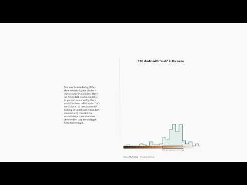
This is where the real magic happens. The “stage” isn’t static; it’s a living element. When analyzing the term “nude,” we don’t just get a pre-made chart. Instead, we see the individual color swatches—the raw data—and as we scroll, they fluidly animate and rearrange themselves into a histogram.
This is a brilliant use of Data Update/Transformation paired with Animated Transition. It’s a moment of pure data-viz delight that does more than just look cool. It visually explains the concept of distribution. You feel like you’re participating in the analysis, watching the pattern emerge right before your eyes. It transforms a potentially dry statistical concept into an intuitive and memorable moment of discovery.
The Narrative Knockout Punch: Visualizing the Argument
The Pudding doesn’t stop at just showing the distribution of “nude” shades. They use the scrollytelling format to deliver the story’s critical point. As you continue to scroll, a new layer of data—the expected distribution of shades—is elegantly overlaid on the existing chart.
This is Facilitating Comparison at its finest. In one breathtaking, scroll-triggered moment, the entire argument of the piece becomes visually undeniable. You can instantly see the discrepancy between how the word “nude” is actually used versus how it should be used if it were applied without bias. No dense paragraphs are needed; the visual does all the heavy lifting. The story then repeats this powerful technique, seamlessly transitioning the chart to analyze the word “natural” and other terms, reinforcing the pattern of bias again and again.
From Guided Tour to Open Playground
After meticulously guiding you through their findings, the authors do something brilliant: they hand the controls over to you. The final section uses Interactive Element Activation, where the scroll reveals a full-fledged exploratory tool. With filters and toggles, you are invited to “play” with the complete dataset of over 5,000 shades.
This accomplishes two things: it serves the narrative function of Providing Detail / Exploration, satisfying the curiosity the story has built up. More importantly, it builds immense trust. The authors aren’t just presenting a black box of conclusions; they are opening their data and methods for you to see for yourself. It’s a confident and empowering way to conclude a data-driven story.
Final Thoughts: A Masterclass in Respectful, Impactful Storytelling
“The Naked Truth” feels so good to scroll through because every interaction is designed with purpose and respect for the user. The pacing is deliberate, the cognitive load is low, and the user feels like an active participant.
Perhaps most impressively, the piece includes a visible toggle to turn off the animations. This commitment to accessibility is a crucial reminder that the most delightful experiences are also the most inclusive ones.
This article is a benchmark for what scrollytelling can be: not just a flashy trend, but a powerful medium for building an argument, revealing truth, and making complex ideas clear, beautiful, and resonant.
Stay tuned for Part 2 of our series, where we’ll deconstruct another incredible piece from the digital storytellers extraordinaire at The Pudding!
